Empowering you to lead with poise and confidence
Role: UX Designer
Project Type: Portfolio Project (School of UX)
Platform: Mobile App
Industry: Retail / Grocery
Tools: Figma, Canva and ChatGPT
Project Overview
This project explored how Sainsbury’s could reduce checkout time in response to the removal of weighing scales at checkout. The focus was on designing a faster, more intuitive scanning and purchase flow, particularly for customers buying loose fruits and vegetables.
Business Problem
Sainsbury’s planned to remove weighing scales from checkout areas, creating friction for customers purchasing loose produce.
The business needed to:
Preserve brand loyalty during a high-friction moment in the journey
Decrease time spent at checkout
Maintain a smooth experience for loose fruits and vegetables
Reduce customer frustration caused by slower scanning or manual lookup
Goal
Design a mobile app experience that:
- Speeds up checkout
- Minimises cognitive load during scanning
- Provides clear shortcuts for common purchases
- Encourages continued use of Nectar rewards
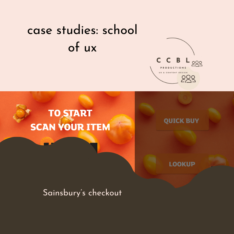
Quick Buy Feature
To reduce decision time at checkout, I introduced a Quick Buy option featuring commonly purchased categories:
Baked goods
Loose vegetables
Loose fruits
Meal deals
These categories reflect high-frequency items and allow customers to bypass manual lookup or scanning delays.
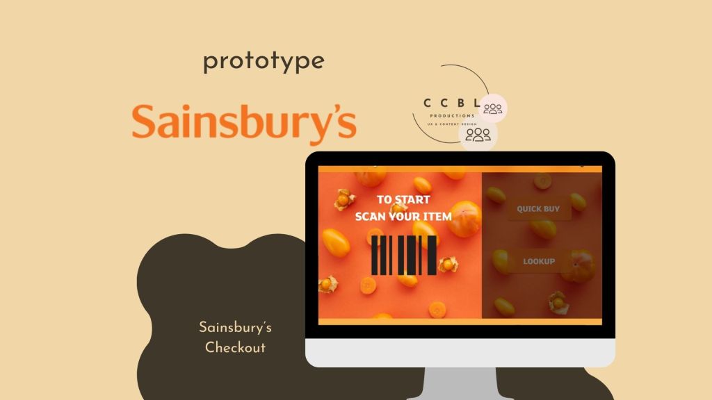
Quick Buy & Lookup
The Quick Buy and Lookup buttons were positioned alongside each other and styled similarly. This visual parity communicates that:
- Both options support product discovery
- Both offer recommended or common selections
- Users can choose the fastest route based on their needs
This reduced hesitation and improved scanning at the point of decision.
Loyalty Integration
A subtle reminder to use Nectar was embedded within the flow to:
- Encourage brand loyalty
- Reinforce value without interrupting checkout speed
- Align business goals with user benefit
Checkout Accessibility
To support fast completion:
- The Checkout button was available on every screen except the start and thank-you screens
- This allowed users to exit the journey at any point and complete their purchase quickly
- The design supported both linear and shortcut-based journeys
Outcome & Learnings
This concept demonstrated how:
- Strategic shortcuts can significantly reduce checkout time
- Familiar categories help users make faster decisions
- Persistent access to checkout improves perceived efficiency
Key takeaways:
- Speed matters most during high-friction moments
- Visual hierarchy can guide faster decision-making
- Loyalty prompts work best when integrated, not intrusive
Latest posts

Designing for High Stakes: How Strategic Email Design Fuelled Laybuy’s Sales Success
In the competitive world of Buy Now, Pay Later (BNPL), your message needs to do more than just reach an inbox—it needs to cut through the noise. During a major sales campaign at Laybuy, I was tasked with designing an email suite that not only looked good but also drove measurable action. The Challenge: Standing…

Debunking Myths in Children’s Activity Sector
There is a common misconception that the children’s activity sector, everything from holiday camps to after-school sports aren’t viable childcare or run by professional, passionate, educated people. In reality, it is a highly regulated, logistically complex industry that requires elite-level organisation. At Coordinate Sport, my mission was to use content to bridge the gap between…

From Graduation to Career: Designing Content That Bridges the “Experience Gap”
For many recent graduates, the transition from university to a professional career feels less like a step and more like a leap across a canyon. At Futureboard Consulting, my goal was to build the bridge. By turning direct user interactions into high-impact long-form content, I helped transform the graduate job search from a source of…
Designed with WordPress