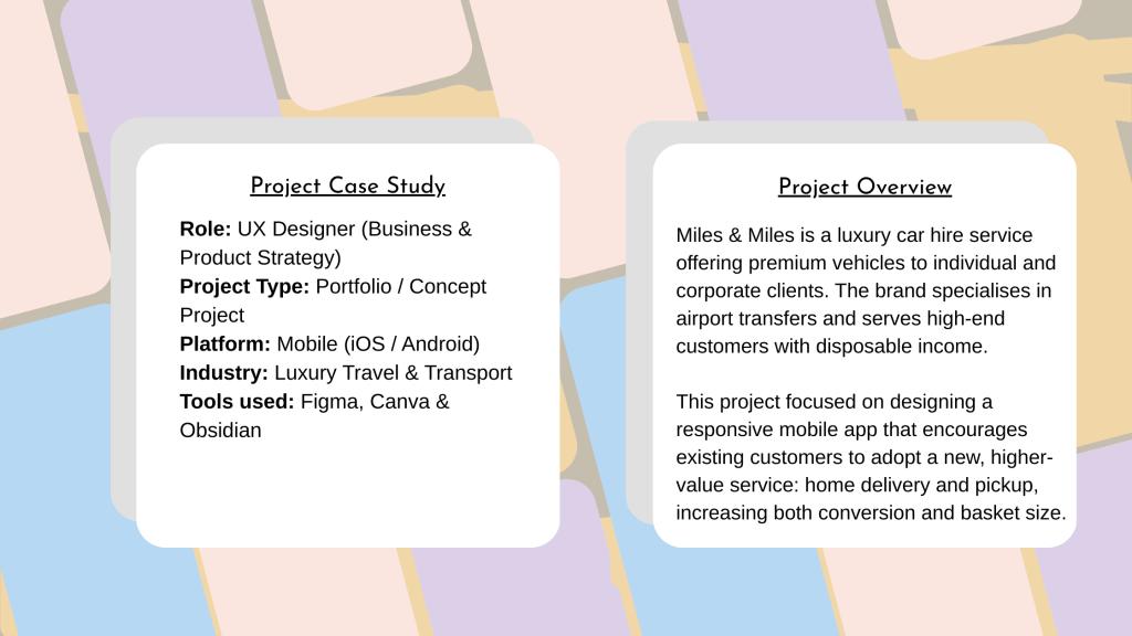
I worked as part of a cross-functional team, including:
- UX Research
- Graphic Design
- UX Design
My primary contribution was providing business and product insight, informed by my background in travel technology, and shaping the user journey to align with commercial goals.
Goal
Design a mobile experience that:
- Improves conversion and basket size
- Nudges users toward higher-value services
- Reduces friction in the booking flow
- Feels personalised and premium for returning customers
Business Problem
Miles & Miles wanted to expand beyond airport transfers and to promote a more expensive, premium home-delivery option.
The challenge was to:
Increase average order value while maintaining a premium, effortless experience
Encourage existing customers to choose home delivery over standard airport pickup
Educate users on a new service without disrupting a familiar booking flow
Goal
Design a mobile experience that:
- Nudges users toward higher-value services
- Reduces friction in the booking flow
- Feels personalised and premium for returning customers
- Improves conversion and basket size
User Journey & Strategy
Designing for Upsell
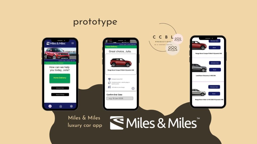
I created a user journey that intentionally prioritised home delivery and pickup:
- Larger, more prominent buttons were used to establish visual hierarchy
- Home delivery was surfaced earlier than browsing cars or airport pickup
- The hierarchy subtly nudged users toward the premium option without blocking alternatives
This approach allowed the business to upsell while maintaining user autonomy.
Improving the Booking Flow
Mobile-First Redesign
The existing website booking flow asked for multiple details upfront (postcode, dates, times, car type), creating friction and visual clutter.
Key design decision
I split this process into multiple, focused screens, which:
- Reduced cognitive load
- Improved scanability on mobile
- Allowed users to see available cars in their area more quickly
Cars were also sorted by availability at the start, helping users understand their realistic options earlier in the journey.
Personalisation & Happy Path
The app was designed primarily for existing customers, keeping them on a smooth “happy path” while still allowing discovery.
Key features included:
- Displaying previously rented cars for faster repeat bookings
- Highlighting similar or upgraded vehicles for upsell opportunities
- Maintaining a clear path to checkout with minimal decision fatigue
Content & Tone
To reinforce a premium, familiar experience, I focused on personalised and conversational copy:
- Example user names were surfaced where appropriate
- Colloquial, friendly messaging reduced formality without harming brand perception
- Copy reinforced confidence and ease throughout the journey
This helped make the service feel curated rather than transactional.
Outcome & Learnings
While this was a portfolio concept project, the design demonstrated how:
- Visual hierarchy can drive commercial outcomes without dark patterns
- Progressive disclosure improves mobile conversion
- Personalisation strengthens loyalty and repeat usage in luxury services
Key takeaways
- Upselling is most effective when embedded into the journey, not added on
- Mobile experiences benefit from early clarity over exhaustive data collection
- Existing customers respond well to recognition and familiarity
Latest posts

Designing for High Stakes: How Strategic Email Design Fuelled Laybuy’s Sales Success
In the competitive world of Buy Now, Pay Later (BNPL), your message needs to do more than just reach an inbox—it needs to cut through the noise. During a major sales campaign at Laybuy, I was tasked with designing an email suite that not only looked good but also drove measurable action. The Challenge: Standing…

Debunking Myths in Children’s Activity Sector
There is a common misconception that the children’s activity sector, everything from holiday camps to after-school sports aren’t viable childcare or run by professional, passionate, educated people. In reality, it is a highly regulated, logistically complex industry that requires elite-level organisation. At Coordinate Sport, my mission was to use content to bridge the gap between…

From Graduation to Career: Designing Content That Bridges the “Experience Gap”
For many recent graduates, the transition from university to a professional career feels less like a step and more like a leap across a canyon. At Futureboard Consulting, my goal was to build the bridge. By turning direct user interactions into high-impact long-form content, I helped transform the graduate job search from a source of…
Designed with WordPress